Review
Blackberry 8800 User Comments
30.11.07 Filed in: Hardware
Okay, I used to be completely against the concept of "Blackberry". Why? Because I didn't want to be available all the time. Not on the toilet, not at the movies, not at dinner. And not at a couple of other activities.
Also, I was (and still am) a loyal follower of the Palm operating system, culminating in a Treo 650 Smartphone. Nothing better out there.
The caveat: at work, we use Lotus Notes. Syncing a Palm device to Lotus Notes is something you shouldn't look forward to. Lost contacts, changed or lost to-dos. Recurring calendar entries that multiplied over several days (now when WAS cousin Armin's birthday? The 28th? 29th? 30th?).
I resisted (successfully) switching to a Blackberry device on the basis that the Treo had a Keyboard while the (then available) BB did not. I installed a version of the Blackberry service for Treo to try to at least get my emails live when I wanted them. That was a fiasco to the power of five! I won't go into the details, but if you're considering trying that software, don't!
To make a long story short: my resistance finally caved in about 6 months ago. I was up for a new mobile device and had seen the 8800 being used by a colleague in the UK. Pretty slick.
After using it for half a year, I can only say - I'm glad I switched! Not because the Treo is no good - its a great little phone with a super efficient and stable operating system. But because I finally get proper syncs between my handheld device and my Notes account. Everything, all the time. Live. What more do you want?
And, to be fair, the voice quality on the 8800 _is_ better than on the Treo. So is the speakerphone. Much better. So is reception. Built-in GPS? WOW!
I can deal with not having a built-in camera, especially because the one built into the Treo was a joke (640x480 just doesn't cut it if you want to document a trip to Rome).
And to be honest, my fear of the "ever available worker" weren't really that realistic. The thing has a function to turn off the radio - obviously, since you wouldn't be able to fly with the device if it didn't.
And: I still have final control over the urge to look or not look at new messages.
At least so far.
Comments
The long road to smartphone heaven
14.05.13 Filed in: Android
This is the prelude to the actual review of the Sony Xperia Pro. If you don’t want to read my gab about how I ended up with the device (in this post), then just skip to the review itself.
Several weeks ago, I took a deep plunge into very cold water (at least from my perspective at the time): I switched from an iPhone 4 to an Android device (see here).
The reasons, in short, were few:
Several months ago, I’d already tried a clip-on, slide-out bluetooth keyboard for the iPhone (that doubled as a case). While the keyboard was really quite good, the connection via bluetooth was a disaster. Not because the electronics in the keyboard (or the iPhone) were an issue, but because - in my opinion - bluetooth just isn’t made for that type of connection.
With a smartphone keyboard, you only use the connection for a couple of seconds (to answer an SMS) to perhaps a minute or two (to write an email). After a while, bluetooth goes to sleep, likely both in the keyboard and the smartphone, otherwise both batteries would be dry in no time. Then, when you next need to use the keyboard, it takes “forever” to wake back up and reconnect.
Why in blazes no-one has put together a slider keyboard for the iPhone that lets you slide the phone into the keyboard case and automatically connect to a real-life dock connector (via which a keyboard connection can be made) is beyond me. There just isn’t a better data connection than a cable.
So off I went into the depths of the internet to find a decent smartphone with a slider keyboard.
I’d actually taken this route before, about a year ago, when I picked up a Blackberry Bold on ebay. I used to be a big blackberry fan back in 2006 or so, when my then-employer offered it. And, to be sure, the keyboard can’t be beat for the size of the device. But folks, the user interface is so… so… well, so 2000-ish!
I had to resort to using my Palm Treo 680 some time last year when the glass on my iPhone ruptured and I’d sent it off to be repaired. Boy, considering how totally awesome the Treo used to be in its heyday, you just can’t use the OS nowadays without retching. I mean: 480x480 and 256 colors? Get real!
Perusing the various google hits on this blog entry or that product test (and about a zillion ads for each interesting link, as is the norm on google nowadays), I was peeved to find that there are no very recent keyboard-fitted smartphones out there! Okay, that changed very recently with the new Blackberry device, but this was before then.
Ebay showed a plethora of Blackberry Torches - a device I nearly ended up getting - until I started reading some of the opinions… and it just goes to show: it was high time Blackberry updated their OS! Apparently, even with OS7, the look and feel were a bit, well … see the comment on the Treo above!
I ended up getting two devices. One was a super deal on a Motorola Pro+ running Android 2.3.5 and the other was a brand new Xperia Pro in red. To be fair, I was quite surprised at the functionality and ease-of-use (no manual needed) of the older version of Android. Which, as it turns out, still powers, what, 70% of all Android phones?
Unfortunately, the Motorola really is a compromise. The screen is tiny (not good for my 45+ year old eyes) as is the keyboard. Perhaps it's an age thing; I used to be able to speed-type on these tiny candy-bar keyboards with very low error rates… no more. To be sure: the Motorola Pro+ Keyboard feels very nice and types quite well. It’s just, well, too small. I also kept hitting the function buttons on top when trying to type numerals.
So I ended up keeping the Sony Xperia Pro. Read on!
Several weeks ago, I took a deep plunge into very cold water (at least from my perspective at the time): I switched from an iPhone 4 to an Android device (see here).
The reasons, in short, were few:
- more and more quirks, the higher the version number of iOS went
- the impossibility of typing on the onscreen keyboard
Several months ago, I’d already tried a clip-on, slide-out bluetooth keyboard for the iPhone (that doubled as a case). While the keyboard was really quite good, the connection via bluetooth was a disaster. Not because the electronics in the keyboard (or the iPhone) were an issue, but because - in my opinion - bluetooth just isn’t made for that type of connection.
With a smartphone keyboard, you only use the connection for a couple of seconds (to answer an SMS) to perhaps a minute or two (to write an email). After a while, bluetooth goes to sleep, likely both in the keyboard and the smartphone, otherwise both batteries would be dry in no time. Then, when you next need to use the keyboard, it takes “forever” to wake back up and reconnect.
Why in blazes no-one has put together a slider keyboard for the iPhone that lets you slide the phone into the keyboard case and automatically connect to a real-life dock connector (via which a keyboard connection can be made) is beyond me. There just isn’t a better data connection than a cable.
So off I went into the depths of the internet to find a decent smartphone with a slider keyboard.
I’d actually taken this route before, about a year ago, when I picked up a Blackberry Bold on ebay. I used to be a big blackberry fan back in 2006 or so, when my then-employer offered it. And, to be sure, the keyboard can’t be beat for the size of the device. But folks, the user interface is so… so… well, so 2000-ish!
I had to resort to using my Palm Treo 680 some time last year when the glass on my iPhone ruptured and I’d sent it off to be repaired. Boy, considering how totally awesome the Treo used to be in its heyday, you just can’t use the OS nowadays without retching. I mean: 480x480 and 256 colors? Get real!
Perusing the various google hits on this blog entry or that product test (and about a zillion ads for each interesting link, as is the norm on google nowadays), I was peeved to find that there are no very recent keyboard-fitted smartphones out there! Okay, that changed very recently with the new Blackberry device, but this was before then.
Ebay showed a plethora of Blackberry Torches - a device I nearly ended up getting - until I started reading some of the opinions… and it just goes to show: it was high time Blackberry updated their OS! Apparently, even with OS7, the look and feel were a bit, well … see the comment on the Treo above!
I ended up getting two devices. One was a super deal on a Motorola Pro+ running Android 2.3.5 and the other was a brand new Xperia Pro in red. To be fair, I was quite surprised at the functionality and ease-of-use (no manual needed) of the older version of Android. Which, as it turns out, still powers, what, 70% of all Android phones?
Unfortunately, the Motorola really is a compromise. The screen is tiny (not good for my 45+ year old eyes) as is the keyboard. Perhaps it's an age thing; I used to be able to speed-type on these tiny candy-bar keyboards with very low error rates… no more. To be sure: the Motorola Pro+ Keyboard feels very nice and types quite well. It’s just, well, too small. I also kept hitting the function buttons on top when trying to type numerals.
So I ended up keeping the Sony Xperia Pro. Read on!
Sony Bridge for Mac
19.05.13 Filed in: Android
Okay, so far I’m relatively happy with my Xperia Pro, which I will review elsewhere.
I find the Sony Bridge for Mac software, however, to be complete rubbish.
It tries to be a sync solution for photos and music, even going so far as to sync with iTunes. I haven’t tested the iTunes sync (as I don’t listen to Music on the Xperia), but the way Pictures are handled is a disgrace.
For one thing, the import - i.e. copying photos shot on the Xperia to a local directory - often brings errors with multiple files (“…couldn’t be transferred…”), apparently, because those files are damaged. As it turns out, this is complete crap; selecting the pictures individually and clicking on “Import selected” transfers them just fine.
There is no way to select individual - or all - pictures to delete them in the import photo mode, which is definitely a function that is necessary to have.
A complete joke is the file browser, which is available by clicking on the phone on the left side and selecting “Browse files on your Xperia device”. It does what it says: it lets you browse files. Delete or move files? Negative.
I’m not sure who does Xperia product management at Sony, but they certainly have not understood that this level of software quality isn’t going to retain customers.
First Impressions: Android Security
22.04.13 Filed in: Android
Apple prides itself for a highly scrutinous overview of all apps submitted to the Apple Appstore.
Anything that might offend or otherwise perturb is denied a listing. For several years, this has been one of my main arguments of iOS over Android, and the argument may very well still be quite true.
However, I’m quite surprised - positively - of the details listed under “Permissions” for each app in the Google Play store, with the permissions you grant each app categorized under
I’m quite certain this is done by an automated process that checks to see which functions are called from within the API. This is information that is completely lacking in the Apple Appstore. Permissions details are also available on the Amazon Android store, by the way, but by far not in as much detail as on Google Play.
As an example, I was about to load Wunderlist onto my Xperia when I read that the app would be given full rights to read my contacts database:
“Allows the app to read data about your contacts stored on your tablet, including the frequency with which you've called, emailed, or communicated in other ways with specific individuals. This permission allows apps to save your contact data, and malicious apps may share contact data without your knowledge. Allows the app to read data about your contacts stored on your phone, including the frequency with which you've called, emailed, or communicated in other ways with specific individuals. This permission allows apps to save your contact data, and malicious apps may share contact data without your knowledge.”
Why the heck would I accept that? There is positively no reason at all for the app to go pilfering through my contacts, as there are no contacts assignable to list entries. While I like the way it is simple to set up different todo lists in Wunderlist, this has - until I get more detailed info - stopped me from installing the app.
I remind the reader about reports on the widely distributed WhatsApp, which apparently transfers all contact data from the mobile device to one of the WhatsApp servers… gee, I wonder what they do with that information…?
So the logical thing to ask is: does Wunderlist also have full access rights to my contacts on iOS? And if it does, why doesn’t Apple disclose that information proactively? Perhaps iOS apps aren’t as secure as they are always daunted?
Anything that might offend or otherwise perturb is denied a listing. For several years, this has been one of my main arguments of iOS over Android, and the argument may very well still be quite true.
However, I’m quite surprised - positively - of the details listed under “Permissions” for each app in the Google Play store, with the permissions you grant each app categorized under
- Network Communication
- Personal Information
- Storage
- System Tools
I’m quite certain this is done by an automated process that checks to see which functions are called from within the API. This is information that is completely lacking in the Apple Appstore. Permissions details are also available on the Amazon Android store, by the way, but by far not in as much detail as on Google Play.
As an example, I was about to load Wunderlist onto my Xperia when I read that the app would be given full rights to read my contacts database:
“Allows the app to read data about your contacts stored on your tablet, including the frequency with which you've called, emailed, or communicated in other ways with specific individuals. This permission allows apps to save your contact data, and malicious apps may share contact data without your knowledge. Allows the app to read data about your contacts stored on your phone, including the frequency with which you've called, emailed, or communicated in other ways with specific individuals. This permission allows apps to save your contact data, and malicious apps may share contact data without your knowledge.”
Why the heck would I accept that? There is positively no reason at all for the app to go pilfering through my contacts, as there are no contacts assignable to list entries. While I like the way it is simple to set up different todo lists in Wunderlist, this has - until I get more detailed info - stopped me from installing the app.
I remind the reader about reports on the widely distributed WhatsApp, which apparently transfers all contact data from the mobile device to one of the WhatsApp servers… gee, I wonder what they do with that information…?
So the logical thing to ask is: does Wunderlist also have full access rights to my contacts on iOS? And if it does, why doesn’t Apple disclose that information proactively? Perhaps iOS apps aren’t as secure as they are always daunted?
Review: IcyBox IB-RD3262+USE2 2fach RAID
28.01.13 Filed in: Hardware
This very attractive little box houses two SATA hard disks and provides the logic to do RAID levels 0 or 1 as well as JBOD. I picked it up via Amazon in Germany as “used but in excellent condition, in original packaging, with some scratches”.
I haven’t found the scratches yet (except on the box), it looks like someone had tested it and sent it back. Instead of 150€, I pad 85€ which suited me just fine.
I installed two WD RED 3TB drives; after several disasters with low-cost drives from Samsung, Seagate as well as WD, I decided to go with something more expensive. The RED drives are made for continuous use in a NAS, so they should be fine in my RAID box attached to my home Mac Mini.
Generally, I don’t bother installing software that is delivered with a device, as there is usually something more recent available online. Not so here. I was unable to find the RAIDMaster software that is delivered with the device online at RAIDSonic (the manufacturer), so I ended up installing the version that came on CD in the box.
Setting up the RAID-1 array was a snap and only took a minute or so. Transfer rates are - in my opinion - quite good, peaking at around 50 MB/s via Firewire 800, with 20-25 MB/s being the usual rate. I’ll add a more scientific bit of information on performance at the end.
Seeing as I was getting around 5 MB/s with the Drobo I had installed previously, this little box was going to be a good replacement.
I’ve spent the last evening / night transferring all my data from the Drobo to the IcyBox device, strangely enough I was getting read rates on the Drobo much in excess of what I’d ever gotten before. I’m not sure, but there may also have been something the matter with my Lion Server installation on the Mini, so after doing all the transfers (and putting data from the Mini onto the RAID as well), I re-installed the entire system this morning.
Before decommissioning the Drobo, I hooked it to my (newer) MacBook Pro and ran a performance check on it. More than 10 MB/s wasn’t available, and that only in peaks. Subsequently, the decision to move from the Drobo to another device was the right one!
The only thing that is a bit of a shame with the IB-RD3262 is that the cooling fan seems to run at full speed, even if the disks aren’t warm. It isn’t very loud, but still present. But perhaps this is the better way to go rather than have the fan speed up and slow down all the time, who knows.
Contacts Bugs in Mountain Lion
05.09.12 Filed in: MacOS
This issue is reproducable and obviously related to what I described in this post:
Dragging a picture, for example off a LinkedIn profile, into Contacts makes the cursor change to a green + when hovering over the picture drop zone, but letting go makes the picture “fall back” to whence it came from.
If I save it to disk (dragging it to a folder works fine) and then drag it from there to the contact I want it displayed in, the framing dialog comes up. In one instance, hitting “Done” didn’t do a thing. I had to switch back to Safari and then drag the picture to Contacts again to make it work.
The second bug comes after syncing the changes to iCloud: while the algorithm that pics out the face works well as usual in automatically cropping even large pictures, the picture contents “snap back” to the original, full-size picture contents once the contact is synced.
I’m very much looking forward to the next Mountain Lion Update (with hopes of having things fixed in there).
Mountain Lion: Image Drag-and-Drop broken?
27.08.12 Filed in: Mac
Something new, I would call it a bug.
One of the really cool things about Mac OS has always been the ability to drag an image from the web browser, say of a person from LinkedIn, to another app, say the image well for that person’s contact.
A hugely time-saving thing to be able to do. Doesn’t work anymore.
I didn’t have this problem in Lion (or previous versions of the OS), ever.
In Mountain Lion, it seems to crop up more often than not. The image is legit - I can still drag it right out of the LinkedIn web page and drop it in a directory open in the Finder. Then, I can drag it from there to the contact card in Contacts. But not directly.
Yes, I’ve updated to 10.8.1 and no, this didn’t fix the issue.
Mountain Lion Update 3
08.08.12 Filed in: Mac
The update from Lion to Mountain Lion turned out to be a bit more stable - at least on my MacBook - than the update from Snow Leopard to Lion (which was a complete disaster), but my opinion about upgrades from one cat to the next has firmed up: one seems well advised to do a clean install of such an update!
In addition to the already mentioned issues with the Ubiquity daemon, a few other things have cropped up. Also, a look at the current entries for Mountain Lion at support.apple.com show that there are massive issues - and quite abnormal ones - with this upgrade.
An example - at least on my MacBook - is the odd misshaping of the DropBox app. While files put into dropbox folders were still synchronized, the DropBox icon as well as the rightclick-menu entry for it disappeared.
This was relatively simple to fix - I just re-installed the current version of DropBox on top of the old app (apparently, with no ill effects), but it was a nuisance nontheless.
MacOS Lion Caveats - 4. Look and Feel / Ergonomics
03.08.11 Filed in: Mac
4.1 - OS in General
I'm not sure what the reason for changing things in the MacOS GUI was - quite possibly, because there might be an impending feeling - had things _not_ changed - that the OS hadn't been changed. However, I really like the use of color to differentiate items and, this should be mentioned, it was Apple who first introduced the concept to a GUI... are we now going Bauhaus or minimalist or what is the reason to take away all color in the tool bar?4.2 - Mail
Mail is one of the apps that - in my opinion - has suffered the most from the GUI revamp as well as having some issues implanted that make working with the app more of a chore than it should be.Take, for example, us road warriors that often have flakey internet connections: if I'm syncing my IMAP accounts while in a train and the connection goes bad, Mail consistently asks me to re-enter the password for the account - as if losing an IP connection actually caused Keychain to drop it into /dev/null! How annoying!
As for the GUI issues, I repeatedly find myself doing a mouse hover over the buttons to make sure I'm hitting the same one. @Apple: the buttons were fine - why did you have to change them?
What also irks me is: Apple has applied the idiotic day naming, found (and hated) in Outlook, to Mail: instead of just writing date and time in the mailbox list, it now uses "Today", "Yesterday" etc. Looking for a particular mail at a particular time? Nope. Time isn't displayed anymore, just the date or "Today... Yesterday... ".
Actually, what is even more freaky: I have set my OS to prefer English language UI content to German, which is in second place (as I work in Germany). Mail has everything of the GUI in English, which the exception of the mail date naming... "Today" becomes "Heute", "Yesterday ... Gestern" and, since there is a specific word in German for the day before yesterday ("Vorgestern"), it uses that too!
Also, things have changed with the way that attachments are displayed. I'm not much of an Outlook fan, but I've always liked the separate "box" within the mail message window for attachments. This way, you see immediately what / if something is attached and you're able to drag-and-drop it to whereever you'd like to have it.
It wasn't implemented that well in Mail under SL, but at least you would see the attachments as separate "file entries" below the header information. Apparently, this is no more (at least I haven't found a way to change it): now, there is only a button for saving attachments, or you can go and scroll to the bottom of the message where, if you're lucky, the attachments are displayed as icons. Mail tends to display single-page PDFs inline, which makes it a pain to extract via drag-n-drop.
MacOS Lion Caveats - 3. Freezing Computer
03.08.11 Filed in: Mac
My MacBook Pro freezes once in a while. Everything. For about 30 seconds or so. Then it just continues working, as if nothing happened. It doesn't seem to be related to a particular application or situation. Never had that with SL and it only happens on the Laptop (luckily). No idea why…
This happens every once in a while, not with any particular application „on top”.
***
Update August 11:
I’ve upgraded my RAM to 8GB, mainly because I realized that both VMWare and Aperture claim incredible amounts of RAM (why does a VM that has 1GB associated with it take 2.4GB real RAM???).
Also, I’ve seen the Kernel process consume up a one GB for whatever reason (this never happened with SnowLeopard!).
So far, the 8GB really helps to speed things up and prevent the system from swapping like crazy. Lets hope the freezing doesn’t pop up anymore with this much RAM...!
MacOS Lion Caveats - 2. Crashing Apps
03.08.11 Filed in: Mac
Okay, I would presume that Lion poses some hurdles for apps certified to run under Snow Leopard. Strangely enough, apps that I would have expected to break, like the printing software for my Brother label printer works without a hitch, while Pages - an Apple product (!) - does the dying swan once in a while (it never did under SL).
One set of applications is behaving just like I expected: with major issues. Microsoft Office 2011. With the quality of this software on the level that it is even after several updates, my expectations weren't very high - but even this level wasn't met.
I won't go into the details here, I can just state that Microsoft is keeping up its bad reputation with me by promising to bring a Lion-ready update for the software MONTHS AFTER LION's RELEASE! This puts the final whop of whipped cream on my theory that Microsoft's only reason for making Office available for the Mac is to take the excellent experience one has with the computer down to par with a Windows machine.
MacOS Lion Caveats - 1. Me.com Issues
03.08.11 Filed in: Mac
I use me.com mainly for keeping several calendars and my contacts in sync over three Macs, an iPad and my iPhone. This worked mostly like a charm - until Lion came along. For whatever reason, me.com syncing is completely broken on my iMac.
I haven't had the time to investigate yet, but it is completely nixed. All my contacts are gone from this device (luckily only from the iMac) and calendars are not being updated.
*** Update Aug. 11, 2011
After much research and almost no results (am I really the only user of Lion with this issue???), I set up a new user and connected it to me.com to sync. Lo and behold, everything works fine, so quite obviously, the Lion upgrade screwed something up with my user account. I may have to switch to a new user and re-do all my settings just to fix this...
Apple, please, send us 10.7.1!
MacOS Lion - Part 2 - Weird wake-up delays with my MacBook Pro
03.08.11 Filed in: Mac
At some point in time about 6 months ago, a weird phenomenon started happening on my MacBook Pro: it had issues waking up from sleep. This comes up in three variants:
a) I have a mouse cursor I can move, but nothing else happens for about 30-60 seconds, then I get a password prompt
b) I get the "spinning disk of death" for about the same time, then the login prompt
c) I get the login prompt immediately, but my password entry doesn't appear until 30-60 seconds after the fact
once in a very great while, I will have "normal" operation: i.e. the login prompt comes up immediately, my password is accepted immediately and the environment appears immediately (as things should be). But this is exceedingly rare.
And yes, I have tried turning off the password protection after wakeup - with the exception of a missing password prompt, nothing is different. And yes, I have tried resetting the NRI. Folks, believe me, I've likely read most of the entries of other people experiencing this effect - apparently, I'm not alone out there. I can tell you, however, that Apple isn't reading these entries, or they would do something about this issue.
I went as far as transplanting my hard drive to another MacBook Pro to see if it was a hardware issue. This is where it gets creepy: for the first hour or two, the problem was gone. "Hey", I thought, "great: get the notebook fixed and everything will be ok!". Nope. This problem is like a virus: after a while, the other MacBook Pro started reacting in exactly the same manner! Weird, huh?
To make this short: I had high hopes that whatever process was broken on my machine, it would be fixed with Lion. You guessed it all along, of course: it didn't.
MacOS Lion - Part 1 - Support of Canon Multifunction
03.08.11 Filed in: Mac
I wasn't going to do it, but in the end, I succumbed to my "greed for progress": I downloaded and installed Lion on the day Apple made it available. I’d like to share my experiences (quite a few of them negative) with Lion with you.
I had high hopes for the new OS. After all, the feature list was well-sold by its Maker. Also, there were a few issues I had with Snow Leopard that I had hoped to have fixed with this release, for example the support of the Canon iSensys MF8350CD Multifunction Printer / Scanner / Fax.
The integration of our MF8350CD multifunction device was abominal in Snow Leopard. Luckily (or unluckily?), I'm not alone here - the amount of frustration that Mac users have typed into blogs, newsgroups and other online sites about these devices is huge. No drivers built into MacOS at all; the device didn't even function using standard drivers (which, according to some blogs, helped some people). The driver supplied by Canon would bomb every 5th print-attempt or so, and running "Repair Disk Permissions" would break it to the point of having to be re-installed. Because I tend to do a preventative RDP relatively frequently, I decided to put the driver disk image on my desktop to help me locate it quickly…
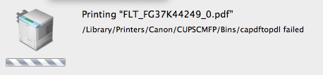
Needless to say, Lion didn't help - quite the contrary. The old (2.02) driver now didn't work at all any more, and the device still wasn't part of the OS printer library. Very recently, Canon released the 2.03 driver, which works, well, sometimes. I would say, 1/3 of the print attempts actually end in a piece of paper coming out of the printer. 1/3 of the time, some daemon that is part of the Canon CUPS environment dies and - apparently - gets restarted, and 1/3 of the time the application issuing the print command goes up in a puff of smoke. Being an experienced user (say "frustrated"), I know that it is IMPERATIVE to save any changes in a Pages document _before_ printing…
I can tell you: I will NEVER buy another Canon printer or scanner ever again (I do love my IOS D350). Canon used to be the absolute market leader in high-performance color printing from the Mac; now, even HP does better - sad but true.
I had high hopes for the new OS. After all, the feature list was well-sold by its Maker. Also, there were a few issues I had with Snow Leopard that I had hoped to have fixed with this release, for example the support of the Canon iSensys MF8350CD Multifunction Printer / Scanner / Fax.
The integration of our MF8350CD multifunction device was abominal in Snow Leopard. Luckily (or unluckily?), I'm not alone here - the amount of frustration that Mac users have typed into blogs, newsgroups and other online sites about these devices is huge. No drivers built into MacOS at all; the device didn't even function using standard drivers (which, according to some blogs, helped some people). The driver supplied by Canon would bomb every 5th print-attempt or so, and running "Repair Disk Permissions" would break it to the point of having to be re-installed. Because I tend to do a preventative RDP relatively frequently, I decided to put the driver disk image on my desktop to help me locate it quickly…
Needless to say, Lion didn't help - quite the contrary. The old (2.02) driver now didn't work at all any more, and the device still wasn't part of the OS printer library. Very recently, Canon released the 2.03 driver, which works, well, sometimes. I would say, 1/3 of the print attempts actually end in a piece of paper coming out of the printer. 1/3 of the time, some daemon that is part of the Canon CUPS environment dies and - apparently - gets restarted, and 1/3 of the time the application issuing the print command goes up in a puff of smoke. Being an experienced user (say "frustrated"), I know that it is IMPERATIVE to save any changes in a Pages document _before_ printing…
I can tell you: I will NEVER buy another Canon printer or scanner ever again (I do love my IOS D350). Canon used to be the absolute market leader in high-performance color printing from the Mac; now, even HP does better - sad but true.
First Impressions: Vikuiti Screen Filter
20.05.11 Filed in: Hardware
I travel a lot, mostly by train. While the German ICE trains have a nice, open-air design (for example: a largish gap between seats), I frequently catch my seat neighbor’s eyes flicking to my screen.
Okay, chances are it is envy (I use a Mac and can work productively) or mere interest in MacOS that makes most folks break established social rules, but you never know - every once an a while, I’m sure I have had a competitor or even a customer sitting next to me without knowing it.
To be brief: for a few weeks, I’ve been thinking about getting one of those screen filters that greatly reduce the field of view to the left and to the right. Patent holder seems to be 3M, as I’ve only seen this type of filter from them, so I picked up a Vikuiti filter made to fit the 13.3 inch diagonal screen of my MacBook Pro.
The distributor in Germany provided a very easy to use online shop and the product arrived two days later by parcel service.
The filter itself is two-sided, meaning that one side has a glossy finish and one has a matte finish. While I love the screen of the MacBook Pro, the glossiness can be an issue when working out side or in a train next to the window, so I chose the matte side forward.
The screen comes with a mounting kit for notebooks as well as desktop monitors. While the latter merely consists of double-sided tape (get serious, guys), the laptop version is in the form of clear plastic strips, which are sticky down half of their length. Two long strips are intended to go on the left and right sides of the screen, while several short ones go on the bottom and, optionally on the top sides and top.
Mounting looked easy enough, however there is something that wasn’t clear from the (non-verbal) instructions: you need to leave some space between the edge of the filter and the beginning of the sticky part of the strip, perhaps 2mm. If you stick it too tightly to the edge of the filter, getting the filter in is impossible. So - off they went, to be re-stuck a little further out. While the strips made nearly clear contact with the glass screen of the MacBook before, they now have a bunch of gunk under the sticky part. They still hold, but don’t look as nice anymore.
One thing I find irritating is that these strips stick out into the actual screen by a little bit - depending on how you place them, up to about 4mm. While they are clear and subsequently see-through, they still represent a bit of an irritation - I hope I get used to them. And, of course, the clear lines of the glossy MacBook display are completely destroyed, but such is life. I would have preferred a filter as large as the entire black part of the display, with clear dual-sided sticky dots to put the filter over the screen. Either with velcro to remove it or permanently.
The effect, of course, is immediately clear:
Summary: it works as advertised, though you have to live with some drawbacks. I’m certainly glad the filter is removable in situations where I work alone.
*** Second impression: June 20, 2011 ***
After using the filter for a month now, I can reflect in more detail on the system.
The solution for holding the filter to the screen is absolute crap. The plastic strips gather dust and grit and look like some grotesque outgrowth on the stylistically quite beautiful MacBook Pro screen.
The filter is impossible to insert with one hand, even with two it is difficult to get it to slide in properly. Making the filter the identical size of the actual display is not only unattractive but requires - as already detailed - for the holding tabs to overlap into the display, making it nearly unreadable at these points.
To summarize: the filter works as advertised. It even reduces reflections on the mirror-like glass screen of the MacBook Pro, which - especially in a window seat on a train - is a plus. The reduction in light transmission is acceptable and was expected.
The system used to hold the filter to the screen is absolutely unacceptable. The manufacturer really needs to think up something different, either a filter that is as large as the display plus border, possibly with velcro attachments or at least a little bit larger so that modified holding tabs can be moved onto the (non-display) border. The holding tabs need to be modified in such that there is a raised edge where the filter is to be inserted, so that it can be slid in without problems.
Okay, chances are it is envy (I use a Mac and can work productively) or mere interest in MacOS that makes most folks break established social rules, but you never know - every once an a while, I’m sure I have had a competitor or even a customer sitting next to me without knowing it.
To be brief: for a few weeks, I’ve been thinking about getting one of those screen filters that greatly reduce the field of view to the left and to the right. Patent holder seems to be 3M, as I’ve only seen this type of filter from them, so I picked up a Vikuiti filter made to fit the 13.3 inch diagonal screen of my MacBook Pro.
The distributor in Germany provided a very easy to use online shop and the product arrived two days later by parcel service.
The filter itself is two-sided, meaning that one side has a glossy finish and one has a matte finish. While I love the screen of the MacBook Pro, the glossiness can be an issue when working out side or in a train next to the window, so I chose the matte side forward.
The screen comes with a mounting kit for notebooks as well as desktop monitors. While the latter merely consists of double-sided tape (get serious, guys), the laptop version is in the form of clear plastic strips, which are sticky down half of their length. Two long strips are intended to go on the left and right sides of the screen, while several short ones go on the bottom and, optionally on the top sides and top.
Mounting looked easy enough, however there is something that wasn’t clear from the (non-verbal) instructions: you need to leave some space between the edge of the filter and the beginning of the sticky part of the strip, perhaps 2mm. If you stick it too tightly to the edge of the filter, getting the filter in is impossible. So - off they went, to be re-stuck a little further out. While the strips made nearly clear contact with the glass screen of the MacBook before, they now have a bunch of gunk under the sticky part. They still hold, but don’t look as nice anymore.
One thing I find irritating is that these strips stick out into the actual screen by a little bit - depending on how you place them, up to about 4mm. While they are clear and subsequently see-through, they still represent a bit of an irritation - I hope I get used to them. And, of course, the clear lines of the glossy MacBook display are completely destroyed, but such is life. I would have preferred a filter as large as the entire black part of the display, with clear dual-sided sticky dots to put the filter over the screen. Either with velcro to remove it or permanently.
The effect, of course, is immediately clear:
- no chance for anyone sitting next to me of seeing anything - the display look completely black.
- someone looking over your shoulder can still see your screen - the reduction in luminance is minimal in angles from top to bottom
- the picture is clearly darker than without the filter, and seems slightly, well, out of focus. I guess the reduction in edge contrast makes it look that way.
- if you get too close to the screen, you’ll have a serious issue reading anything that isn’t smack in the center, as the blocking effect of the filter also works in that direction (obviously) - you’ll have to maintain at least 50cm distance to the screen to avoid this effect, something that may be difficult on an economy airplane seat.
Summary: it works as advertised, though you have to live with some drawbacks. I’m certainly glad the filter is removable in situations where I work alone.
*** Second impression: June 20, 2011 ***
After using the filter for a month now, I can reflect in more detail on the system.
The solution for holding the filter to the screen is absolute crap. The plastic strips gather dust and grit and look like some grotesque outgrowth on the stylistically quite beautiful MacBook Pro screen.
The filter is impossible to insert with one hand, even with two it is difficult to get it to slide in properly. Making the filter the identical size of the actual display is not only unattractive but requires - as already detailed - for the holding tabs to overlap into the display, making it nearly unreadable at these points.
To summarize: the filter works as advertised. It even reduces reflections on the mirror-like glass screen of the MacBook Pro, which - especially in a window seat on a train - is a plus. The reduction in light transmission is acceptable and was expected.
The system used to hold the filter to the screen is absolutely unacceptable. The manufacturer really needs to think up something different, either a filter that is as large as the display plus border, possibly with velcro attachments or at least a little bit larger so that modified holding tabs can be moved onto the (non-display) border. The holding tabs need to be modified in such that there is a raised edge where the filter is to be inserted, so that it can be slid in without problems.
Worst iPhone App ever?
The CeBIT trade fair seems to be shrinking every year, but it is still a moloch when it comes to trying to find your way around. Like the year before, an official iPhone App („CeBIT2Go”) for the 2011 CeBIT trade fair was released; the description seemed to promise to make a visit to the fair as easy as shopping at Amazon.
What would I expect from such an app? Well, I would certainly like to see a search by exhibitor, as well as a search by the topic I’m trying to find exhibitors for. All that is in there, and more, but that is where the good news stops.
The app gave me the impression of a group of overzealous designers (of the function follows form lobby) and a computer science student just out of college having teamed up a week before the start of the fair.
Search by portions of an exhibitor name? Nope!
Search just by a buzzword for a particular topic? Never!
Quick response of the app? Not here!
In fact, the app takes forever to initialize (okay, I use a 3GS and not an iPhone 4, but the speed difference isn’t that dramatic). It crashed twice on me, out of the blue. The relatively neat feature of being able to track the shuttle busses on the fairgrounds (to see if one is near you) comes up with „position server unavailable” relatively frequently.
To summarize: a trade fair that focusses on high-tech and software should rather NOT release an app than something of such low quality.
Unbelievable Experiences with Entourage 2008
Folks, I’m not a big fan of Windows, that’s why I use a Mac. I don’t make a big secret of that.
Unfortunately, a large part of the IT world is still blinded by the dark side; subsequently, my employer makes software to run on MS Windows, not on Linux or Apple. Which also means that we use Microsoft Office internally, including that wanton beast, Exchange Server.
Mind you, I much prefer Exchange / Outlook to what I used at my previous engagement, which was Lotus Notes. You think you have it bad because you have to use Outlook? Think again!
Microsoft has offered “Office for Mac” for a number of years now; an ex colleague was extremely happy with it, even proffed that it was better than the comparable Office for Windows. You might think “okay, that isn’t very difficult to achive” - and I would agree.
Unfortunately, to keep with the standard file types my colleagues generate, I’m using Office for Mac 2008. Let me tell you: it is the worst piece of software on my machine. Sometimes I think Microsoft put in all those bugs and rediculous “ergonomics” to create some sort of disappointment with that non-dark-side operating system this software runs on.
Besides some serious stability issues with the rest of the applications, as well as lacking VisualBasic or even Macro support in Word and Excel, MS also provides an Outlook “replacement” for Exchange, called Entourage.
I doubt that I have ever used a piece of software more bug-ridden than this sad piece of work. Besides the fact that it regularly spits out bizarre error messages with error numbers you will find NOWHERE on the internet (certainly not on Microsoft’s extremely sparse support site for the Office 2008 suite), I have the strangest problems with it.
I’ll give you an example that is currently plaguing me: I write emails in German and English, and sometimes I need to include words in Turkish when I communicate with our Turkish reseller. I’ve already turned off the spellchecker, yet Entourage insists on changing words I enter in Turkish to some bizarre German “equivalent”. I can’t get it to stop. It won’t even let me change the words back - if I do that in the About field and then go back to my text, for example, BANG it changes it back.
Microsoft is bringing out Office 2010 for Mac sometime this year - and let me tell you, I certainly hope the “real” Outlook that is supposed to ship with that package is any better than this crap!
Sonnet Carapace MacBook Keyboard Cover
09.11.09 Filed in: Mac
While a keyboard cover for a laptop that is used extensively on the road, including tight airplane seats and seat neighbors with red wine glasses and a case of the jitters, this particular one isn’t what it is cracked up to be.
The advertising indicates that the silicon cover basically welts itself onto the keys, leaving no change in the touchtype-feeling as with the uncovered keyboard.
Both indications are not true. For one thing, a MacBook keyboard covered with the Carapace looks like a disease befell it. I received multiple enqueries about what had happened to my keyboard, with guesses of “vaseline”, “heat” or other, even less desirable possibilities being the standard. The cover never “loses” the air pocket between the silicon and the keycap, no matter what you do (okay, I didn’t try a rolling pin).
Secondly, the keyboard with the cover applied, feels strange. It smells odd. Your fingers smell odd after working for a while (much like those popular kids toys made of silicon that have flashing lights inside). Also, it definitely slows down your typing speed, if you touchtype.
Lastly, and this proved to be the reason I decided to ditch the cover after only four weeks of use: it started sticking to the display, so that it would half pull off when opening the laptop. This, of course, would ruin the effects of any air removal scheme that had been applied beforehand.
If you work with the Mac in an area where fluids or dust are likely to cover it, then this keyboard cover will certainly seal off the keyboard quite well, though I don’t know how you’re going to prevent liquids or dust from entering various other openings.
After taking it off the keyboard, by the way, I had a residual oily feel on the keycaps for quite a while afterwards.
Experiences with OpenOffice 3 (Mac)
I'd like to quickly pass on some of the experiences I've made using OpenOffice 3.01 on the Mac. Having used an iMac for over two years, I kept up-to-date on NeoOffice, loading updates as they came along. While not entirely happy with the way the GUI is structured on NeoOffice - it goes its own way in choice of icons and menu structure, it was quite ok from a technical standpoint in having to work with Microsoft Office (.doc) files, at least those produced by Office 2003.
I had chosen to use NeoOffice over OpenOffice 2.0 because, quite frankly, OO 2.0 was a fiasco in usability and stability - I dumped it just days after installation. Then came OO 3.0, and with it a very likable interface feeling (if you're used to MS Office 2003). When I got my MacBook two weeks ago, I decided to install OO 3.0 on it rather than NeoOffice.
Unfortunately, I have to admit that I am disappointed. I can accept that the import of MS Office 2007 files (i.e. .docx) doesn't work properly. I'm sure MS works very hard in making the format difficult to work with when using software that is not from MS. However, not only are there serious issues in using Office 2003 files, such as included images disappearing, bullets changing from a round (yep: "bullet") graphic to - of all things - a directors clapboard (where the hell did that come from?), fonts changing even though equivalents are available (i.e. Arial to Helvetica). But actually working with even native files is - at times - quite frustrating.
For example, I had cut-pasted a text fragment from Firefox into a document. The font changed in size and color, even from what the browser displayed - quite outlandishly, really. No problem, I thought. In MS Office, you select the malignant text and do a single click on the format selection (i.e. "Standard") to change it back to how this format is defined. In OO? Nothing happens. I opened the formats dialog box and started wildly selecting different formats, from Headings to Footer. Nothing. Only when I selected Format-->Standard format (Cmd-M) did the text change. What a pain.
OO, like MS Office, has automatic capitalization, for example at the beginning of a sentence (in case you forget to hit Shift). I'm not a fan of this option, but I hadn't bothered to turn it off. I was generating the contents of a table, and every time I hit tab to get to a new column (not yet in table format), OO would capitalize the first word typed. I suppose you could argue for hours wether this is right or not. In MS Office, this isn't an issue. You hit Control-Z and Word undoes the automatic capitalization. Somewhat annoying, because you have to remember to hit Control-Z before typing the next word, but one gets used to it. In OO? Not so. Hitting Cmd-Z does undo the capitalization but then OO puts the cursor at the beginning of the word! Who the hell came up with that stupid idea?
Another thing I've come across is that OO doesn't render the text - especially in tables - correctly when scrolling up or down a page. I.e. you're scrolling down, looking for a passage of text and a table comes up from below. Quite frequently, the contents of that table will be incompletely rendered or distorted. Very strange, I've never seen this with any other app on the Mac, so I'm presuming its an OO problem and not a Cocoa problem.
All in all, I will likely load up NeoOffice on my MacBook at my next connection to broadband. While I still prefer the UI of OO to NeoOffice, these issues indicate to me that OO 3.0 isn't really ready for the mainstream yet. Maybe I'll wait for 3.1 or 3.2 before trying again.